
Mastering where to place each product on your face is the secret behind every stunning makeup application, yet it’s rarely taught in a simple, visual way. That’s where a makeup placement face chart becomes your best friend—allowing you to map out contour, highlight, blush, and more on a two-dimensional template before you ever pick up a brush. These twenty-one practical insights will help you read your own features more clearly, avoid common placement mistakes, and build looks that feel uniquely yours without guesswork.
1. Understand Your Unique Face Shape Before You Start

Every face chart begins with one essential truth: no two faces are identical, and cookie‑cutter placement rarely flatters. Before you draw a single line on your chart, take time to identify whether your face leans oval, round, square, heart, or diamond. Face shape determines how light and shadow naturally fall, which directly influences where you should place bronzer, blush, and highlighter for a harmonious result. A round face, for example, benefits from vertical placement along the temples and hollows of the cheeks, while a square shape calls for softened, rounded edges around the jawline.
Using a face chart to map your specific shape removes the intimidation from professional techniques. You can literally trace your own proportions onto a blank template, noting where your cheekbones sit highest or where your forehead curves inward. This practice transforms abstract advice into a personalized roadmap that you can reuse and adjust. When you understand your underlying bone structure, every product you apply—from foundation to finishing powder—will land exactly where it creates the most flattering effect.
2. Map Symmetry Before Adding Any Color or Shadow
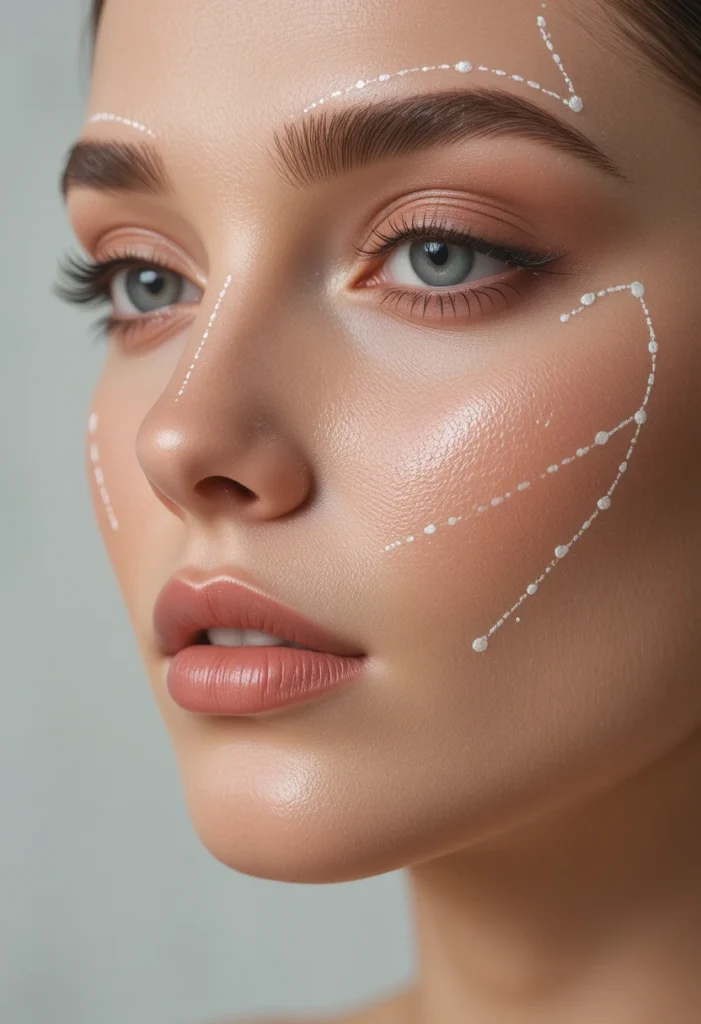
Even the most beautifully pigmented eyeshadow or blush will look disjointed if placement isn’t balanced across both sides of the face. Start every face chart session by lightly marking key symmetrical landmarks: the center of the forehead, the bridge of the nose, the cupid’s bow, and the center of the chin. These reference points keep your contour, highlight, and color applications even, preventing one cheek from appearing lower or one eyebrow from sitting higher than the other on paper—translating directly to more balanced real‑life application.
Symmetry doesn’t mean perfect mirroring, because nobody’s face is perfectly identical from left to right. Instead, use your face chart to notice small asymmetries, like a slightly flatter cheekbone on one side or a higher brow arch. Acknowledging these differences on the chart allows you to adjust placement amounts accordingly: a touch more highlighter on the flatter side, or a slightly softer contour on the more prominent side. This nuanced approach elevates your makeup from generic to gracefully customized, working with your natural features rather than against them.
3. Place Blush According to Your Facial Structure, Not Trends
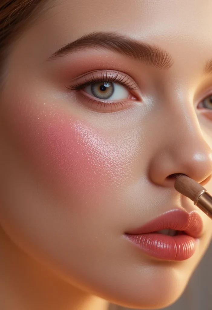
Trends often push blush high on the apples of the cheeks or draped across the nose, but those placements don’t suit every face shape. On your face chart, experiment with three classic blush zones and see which one aligns best with your bone structure. For long faces, horizontal placement across the cheeks and nose bridge visually shortens the midface. For round faces, placing blush in a diagonal line from the outer cheekbone toward the temples adds lift and elongation. Heart‑shaped faces benefit from blush concentrated slightly below the apples to balance a wider forehead.
Writing these variations onto your face chart creates a permanent visual reference. You’ll notice that the same blush color can look completely different depending on whether it sits two millimeters higher or lower. Mastering blush placement on paper first saves you from muddy, over‑blended results on your actual skin. Once you find your ideal zone, you can confidently apply cream or powder blush knowing exactly where to start and where to fade, bringing a natural flush that supports your facial architecture instead of fighting against it.
4. Position Highlighter Where Light Naturally Hits Your Face First
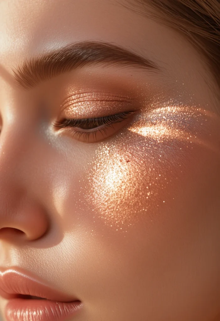
Highlighter is meant to mimic a natural glow, not a stripe of metallic shimmer. On your face chart, mark the areas where sunlight would touch your face if you were standing outside at noon: the tops of your cheekbones, the bridge of your nose, the brow bone, the cupid’s bow, and the inner corners of your eyes. Placing highlighter in these five zones creates a radiant effect that looks effortless rather than painted on. Many people make the mistake of applying highlighter across the entire cheek, which flattens the dimension instead of adding it.
When you map highlighter on a chart, you also learn where to avoid it. For example, putting shimmer on the tip of the nose can make it appear wider, while highlighting the center of the forehead can emphasize oiliness. A thoughtful face chart teaches restraint—you’ll see that sometimes less is more. By sketching your glow zones first, you train your eye to reserve highlighter for the high points only, resulting in a fresh, lit‑from‑within finish that photographs beautifully and wears naturally throughout the day.
Read Also: 23 Easy Up Dos for Thinner Hair Looks Tips: Effortlessly Add Fullness and Feel Gorgeous Every Day
5. Contour Below Your Cheekbones, Not Inside the Hollow
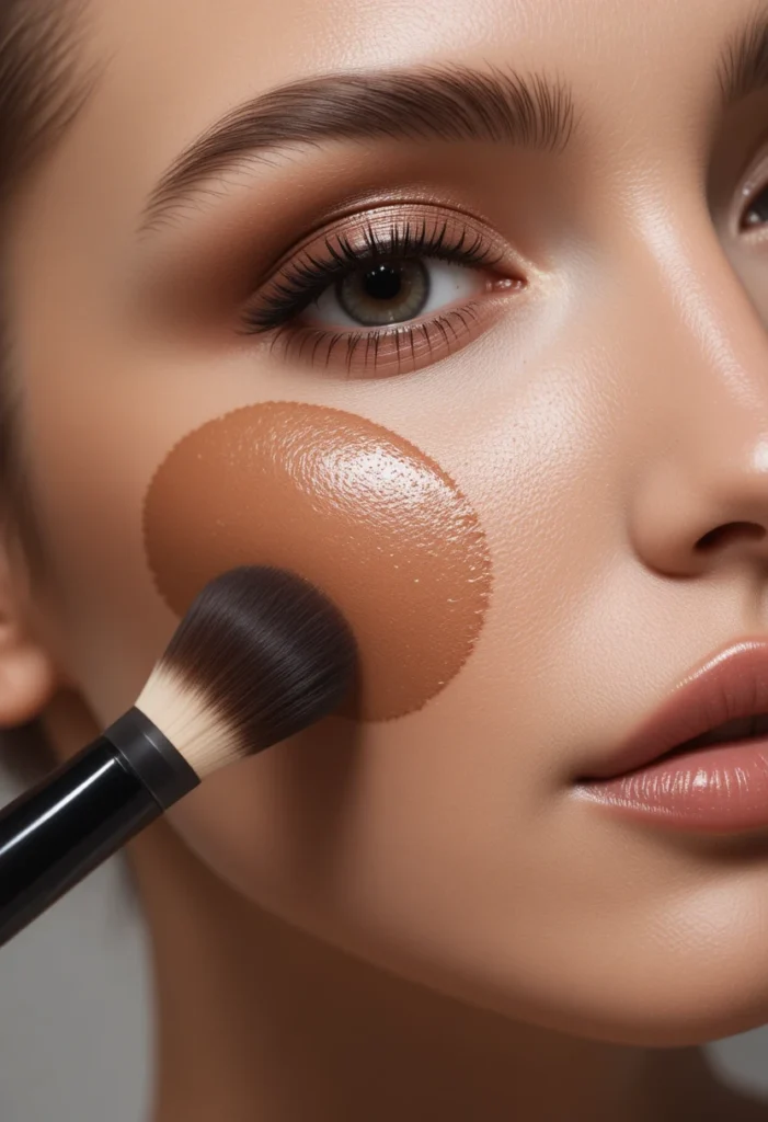
One of the most common placement errors is dragging contour too far toward the mouth, which creates a muddy, aged effect. On your face chart, locate your cheekbone by feeling for the ridge beneath your eye. Then draw a thin line just below that ridge, starting from the top of your ear and stopping about two finger widths away from the corner of your mouth. This placement lifts the face visually because it mimics the natural shadow created by high cheekbones. If you draw the contour line too low, near the jawline area, your cheeks will appear saggy instead of sculpted.
Using a face chart to practice this placement removes the fear of going too heavy or too low. You can erase and redraw the line until it looks exactly like a soft shadow on the chart. Remember that contour should never be a solid stripe; on your chart, blend the edges inward so the line fades into your skin tone. This visualization exercise helps you understand that contour is about creating depth, not drawing a new face shape. Once you master the position on paper, you’ll instinctively reach for the right spot every time you pick up a contour powder or cream.
6. Set Bronzer Where the Sun Would Naturally Warm Your Skin

Bronzer placement differs from contour because its purpose is warmth, not shadow. On your face chart, think of the number “3” or “E” shape depending on which side you view. Start at the top of your forehead near the hairline, sweep down the temple, graze just under the cheekbone, and then continue along the jawline. This classic “3” placement mimics a natural tan because those are the areas that catch sunlight first. Avoid putting bronzer on the entire front of your face, which can look dirty or orange.
Your face chart allows you to adjust this pattern for your specific proportions. If you have a shorter forehead, draw the bronzer line closer to the hairline to avoid lowering your brow area. For wider jawlines, concentrate bronzer on the corners rather than the entire jaw. Mapping bronzer first prevents over‑application because you can see exactly where the warm tones begin and end. When you later apply bronzer to your skin, you’ll follow the chart’s gentle curves, sweeping the product in soft, circular motions that leave you looking sun‑kissed, not streaky.
7. Place Concealer in a Triangle, Not a Crescent Moon
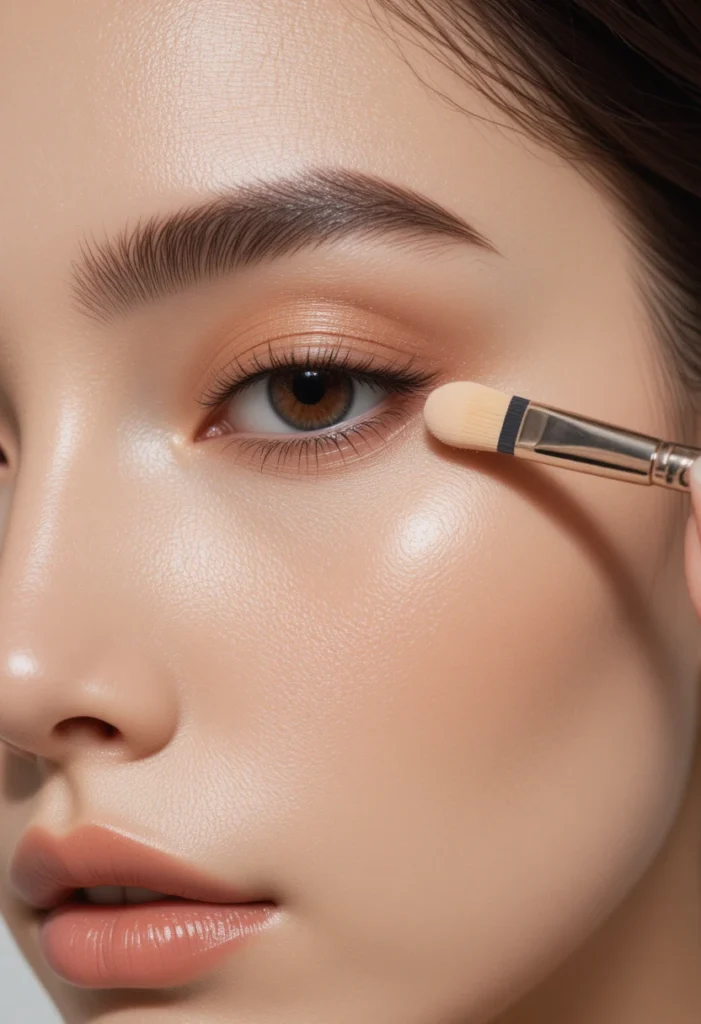
Under‑eye concealer often fails because people draw a little half‑moon shape directly under the lash line. On your face chart, try a triangle placement instead: one point at the inner corner of your eye, one point at the outer corner, and the third point about one inch down toward your nose. This triangle brightens the entire undereye area, the upper cheek, and the side of the nose all at once. The flat triangular shape blends seamlessly because it covers the darkest part of the hollow while feathering into lighter areas.
Practicing this on a face chart reveals why the triangle method works so well. The broad base of the triangle (near your nose) diffuses concealer naturally, while the pointed top (near the outer eye) lifts the face. Your chart will show you that the crescent shape leaves dark circles untouched on the inner and outer edges, which is exactly where shadows often hide. Once you’ve drawn the triangle a few times on paper, you’ll never go back to the old way. This single placement hack can make you look more awake and refreshed without adding extra product.
8. Map Eyebrow Filling Based on Your Natural Arch, Not a Stencil
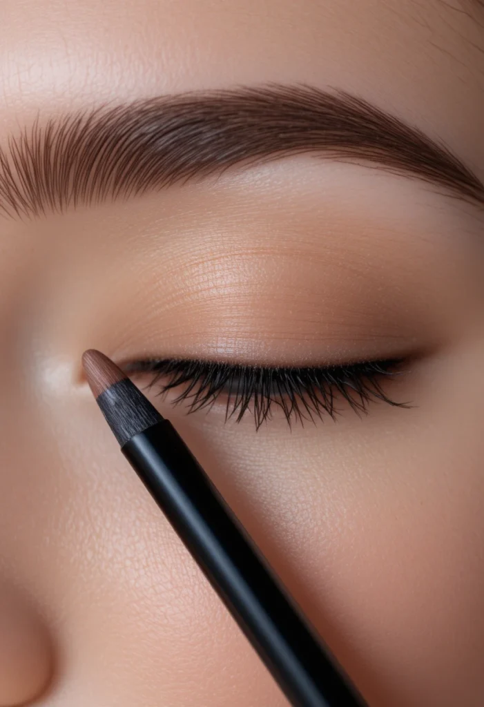
Eyebrow placement on a face chart is about understanding where each part of the brow should be fullest. Mark three key points: the start of the brow aligned with the side of your nose, the highest arch aligned with the outer edge of your iris, and the tail aligned with the outer corner of your eye. Drawing these reference points first prevents the common mistake of filling brows too long or too blocky. Your chart will show you that the front of the brow should be softer and lighter, while the arch and tail can handle more density.
Using a face chart also helps you correct asymmetry between your left and right brows. Trace both brows lightly on the chart and compare the arch heights and tail lengths. You may notice one brow sits higher naturally—that’s normal. The goal is not perfect mirroring but balanced intensity. When you fill your brows later, you’ll know to add a few extra strokes to the lower arch or soften the higher one. This thoughtful placement makes your brows look naturally full and supportive of your eye shape without screaming “drawn on.”
9. Position Cream Products Before Powder for Layered Placement

When working with a face chart, the order of placement matters as much as the position. Always map where you will put cream contour, blush, and highlighter before you plan your powder layers. Cream products need to sit on top of foundation but underneath powder so they melt into the skin. On your chart, use a dashed line for creams and a solid line for powders. This visual separation reminds you that cream placement should be slightly broader because it will be blended out and set, while powder placement can be more precise.
The real‑life benefit of charting cream placement first is that you avoid the “caked” look. When you put powder contour directly over cream contour in exactly the same spot, the products can become heavy and patchy. Your chart will show you where to layer and where to leave breathing room. For example, cream blush might cover a wider area, while powder blush focuses only on the highest point of the apples. By planning this on paper, you create a natural gradient that lasts all day and never looks overdone.
10. Place Eyeshadow Transitions in the Crease, Not Above It
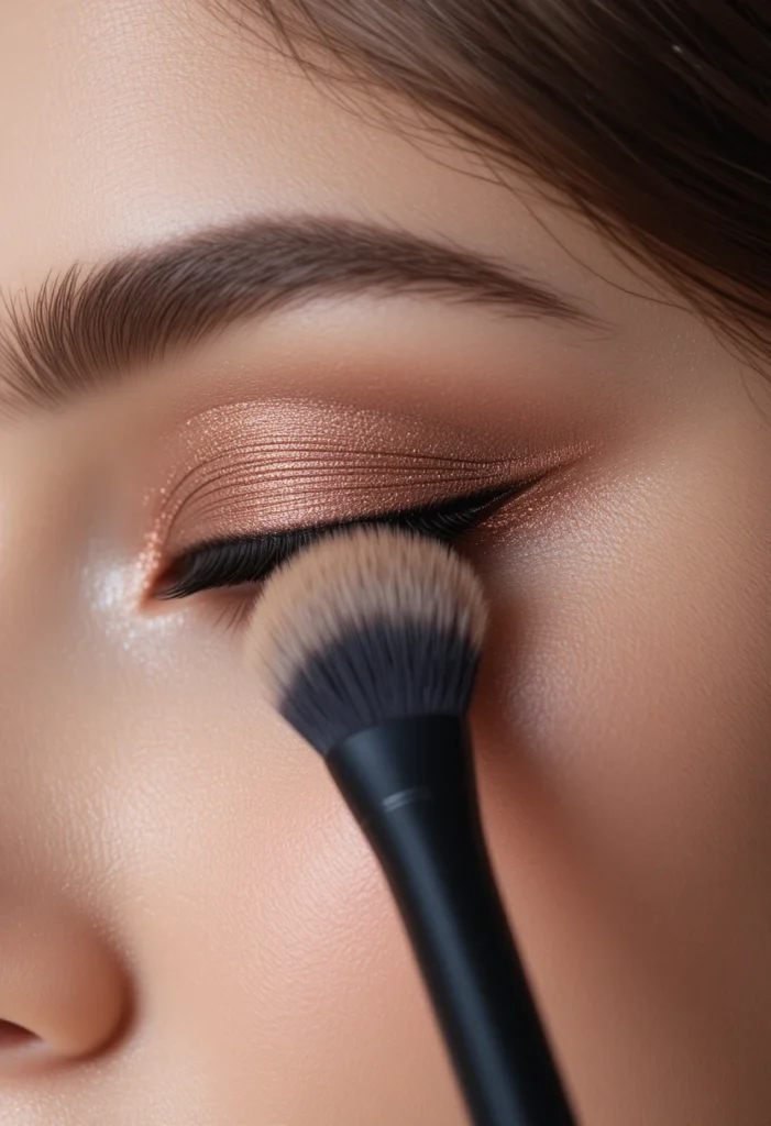
The crease of your eye is a natural hollow that defines the entire eye shape. On a face chart, draw a soft curve that follows the socket line—the indentation you feel when your eye is open. This is exactly where transition eyeshadow should go. Too many people place shadow above the crease, which can make the brow bone look heavy and the eyes appear smaller. Keeping transition shades inside or just grazing the crease maintains a lifted, open appearance, especially for hooded or deep‑set eyes.
Your face chart gives you a chance to practice this for each eye shape. For round eyes, take the crease color slightly higher at the outer corner. For almond eyes, keep the curve evenly rounded. Mapping the crease on paper trains your muscle memory so you don’t accidentally drift upward when applying shadow. You’ll also see that the outer third of the crease can handle deeper shades, while the inner third stays lighter. This targeted placement creates dimension without harsh lines, making your eyes look larger and more defined in any lighting.
11. Map Lower Lash Line Shadow One‑Third of the Way Only
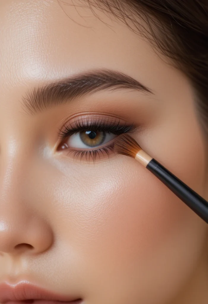
Bringing eyeshadow under the lower lashes is a powerful technique, but full‑line placement often looks harsh. On your face chart, mark the lower lash line from the outer corner inward, stopping at about one‑third of the way toward the inner corner. This concentrated outer placement drags the eye outward, creating a subtle cat‑eye effect without liner. If you take shadow all the way to the inner corner, the eye can appear smaller and more closed off, especially on smaller eye shapes.
Using a face chart to visualize this rule prevents the common “raccoon eye” mistake. Draw the lower shadow as a soft wedge that starts thin at the outer corner and fades out before reaching the middle of the eye. Your chart will also show you how thick to make this shadow—generally no wider than your lower lash line itself. When you eventually apply shadow to your actual eyes, you’ll remember the chart’s boundary and tap off excess product. The result is a sultry, blended lower lash line that adds depth without overwhelming your natural eye shape.
12. Position Lip Lighter in the Center Only for Natural Volume
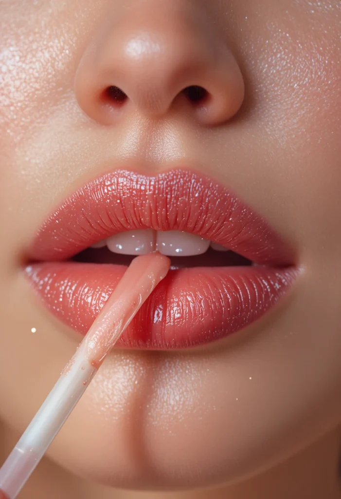
Lip placement on a face chart often focuses on the outer perimeter, but the most impactful placement is actually in the center. Mark a small oval in the middle of your bottom lip and a tiny circle in the middle of your top lip. These are the spots for a lighter lipstick or gloss if you want to create the illusion of fuller lips. Placing light only in the center draws the eye to the mouth’s natural plump area, while leaving the corners darker gives definition and prevents the “floating lip” look.
Your face chart will clarify why all‑over light lips can look flat. When you cover your entire lip with a light shade, you lose the natural shadow at the edges, making lips appear smaller and less sculpted. By confining the lighter product to those center zones, you create a gentle ombré effect that looks like natural volume. You can practice drawing this placement over different lip shapes—thin, full, uneven—and see how the center oval can be widened or narrowed to suit your preferences. This tiny placement adjustment makes a dramatic difference in real life.
13. Place Powder Under the Eyes First, Then Set the Rest
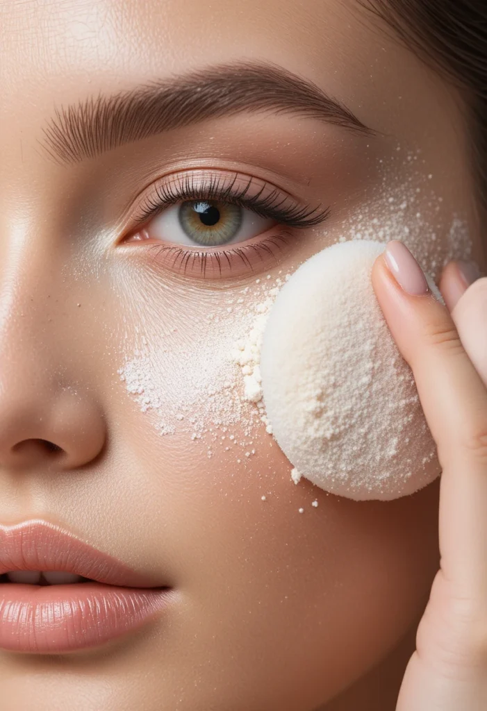
Baking or setting the undereye area requires precise placement to avoid a dry, cracked look. On your face chart, draw a small triangle directly under each eye where you would apply loose powder. This triangle should be about the size of your concealer triangle but slightly smaller so that you don’t powder beyond the area that actually creases. The rest of your face—forehead, nose, chin—gets a lighter, more diffused powder placement. Confining heavy powder to just the undereye triangle prevents the rest of your skin from looking parched.
Seeing this on a face chart helps you understand why all‑over heavy powder fails. When you powder your entire cheek or jawline with a thick layer, fine lines and texture become more visible. Your chart will show you that the undereye triangle is the only zone that truly needs “baking.” The forehead, for example, might only need a quick swipe of translucent powder, not a thick packed layer. By mapping these different powder placements, you preserve your skin’s natural glow while still controlling shine where it matters most—under the eyes, where concealer tends to move throughout the day.
14. Map Blush and Bronzer Separation for a Cohesive Look
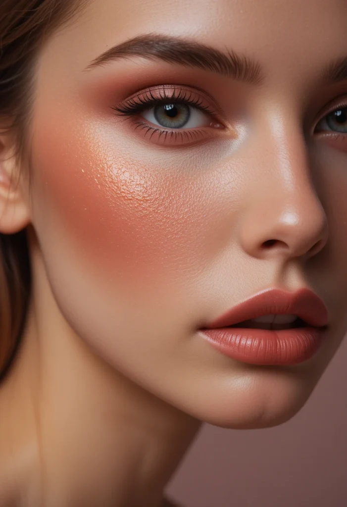
Blush and bronzer often compete for space on the cheeks, leading to muddled placement. On your face chart, draw a horizontal line at the level of your nostrils—this is your dividing line. Bronzer belongs above this line, on the upper cheekbone and temple. Blush belongs below this line, on the apples or slightly lower depending on your face shape. When you keep these two products separate by that invisible boundary, they each perform their job: bronzer warms and sculpts, while blush adds life and freshness.
Your face chart allows you to adjust this division based on your proportions. For a shorter midface, you might lower the blush placement slightly. For a longer face, raise the bronzer higher toward the hairline. Drawing both placements on the same chart prevents overlap and shows you exactly where each product should fade into the other. You’ll see that a tiny bit of blending at the edges is fine, but the core placement zones remain distinct. This simple mapping trick eliminates the muddy brown‑pink mess that happens when products are swirled together without intention.
15. Position Nose Contour Based on Your Bridge Width, Not a Straight Line
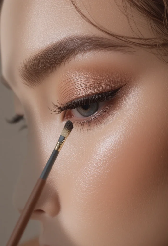
Nose contouring fails when people draw two parallel lines from brow to nostril. On your face chart, look at the width of your nose bridge. If your bridge is wide, place the contour lines closer together to create the illusion of a narrower bridge. If your bridge is already narrow, place the contour lines only on the sides of the nose tip, not along the entire length. Drawing a straight line all the way down makes even a narrow nose look pinched and unnatural, while skipping the bridge entirely leaves the nose undefined.
Using a face chart to test different nose contour placements is risk‑free. Sketch a thin line on each side of the nose, starting just below the brow bone and stopping at the nostril curve. Then look at the chart from arm’s length—does that placement look like a natural shadow or a drawn line? Adjust the length and intensity until it mimics real lighting. You’ll notice that most people only need contour on the upper half of the nose or just the tip, not both. This nuanced placement keeps your nose looking sculpted but still believable, blending seamlessly into your foundation.
16. Place Highlighter on the Chin Sparingly for Balance
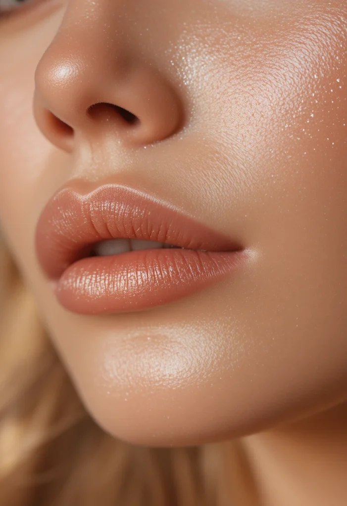
The chin is often forgotten in face charts, but its placement affects overall facial harmony. Mark a small, soft dot of highlighter in the center of your chin, no larger than a pea on the chart. This tiny highlight balances the glow you’ve placed on your forehead and cheekbones, drawing the eye down to complete a triangle of light. However, if you have a very pointed or long chin, skip this placement entirely, as it can exaggerate length. A rounded or short chin benefits the most from this center dot.
Your face chart reveals that too much chin highlighter looks greasy, not glowy. Many people mistakenly draw a large oval or a vertical stripe along the entire chin. The chart will show you that a concentrated spot in the center reflects light upward, making the chin appear more proportionate. If your chin has natural shadow on the sides, leave those areas matte. This precise placement works with your bone structure rather than against it, adding just enough brightness to finish your look without drawing unwanted attention to the jawline.
17. Map Forehead Highlighter Only on the Center Third

The forehead is the largest flat plane on your face, and haphazard highlighter placement here can look sweaty. On your face chart, draw a small oval in the center of your forehead, right between your brows and about an inch tall. This is the only area that should receive highlighter. Keeping highlight confined to the center third prevents the sides of your forehead—near the temples—from looking shiny. The sides naturally recede into shadow, so putting light there would flatten your forehead’s natural curve.
Practicing this on a face chart helps you see why an all‑over forehead glow fails. When you highlight the entire forehead, you lose the subtle gradient of light that creates a rounded, three‑dimensional look. Your chart will show you that the center oval catches overhead light, while the outer corners stay matte to frame the face. If you have a wider forehead, you can slightly widen the oval; if your forehead is narrow, keep it as a small dot. This strategic placement gives a youthful, hydrated appearance without crossing into oily territory.
18. Position Lower Lip Shadow Just Under the Vermilion Border
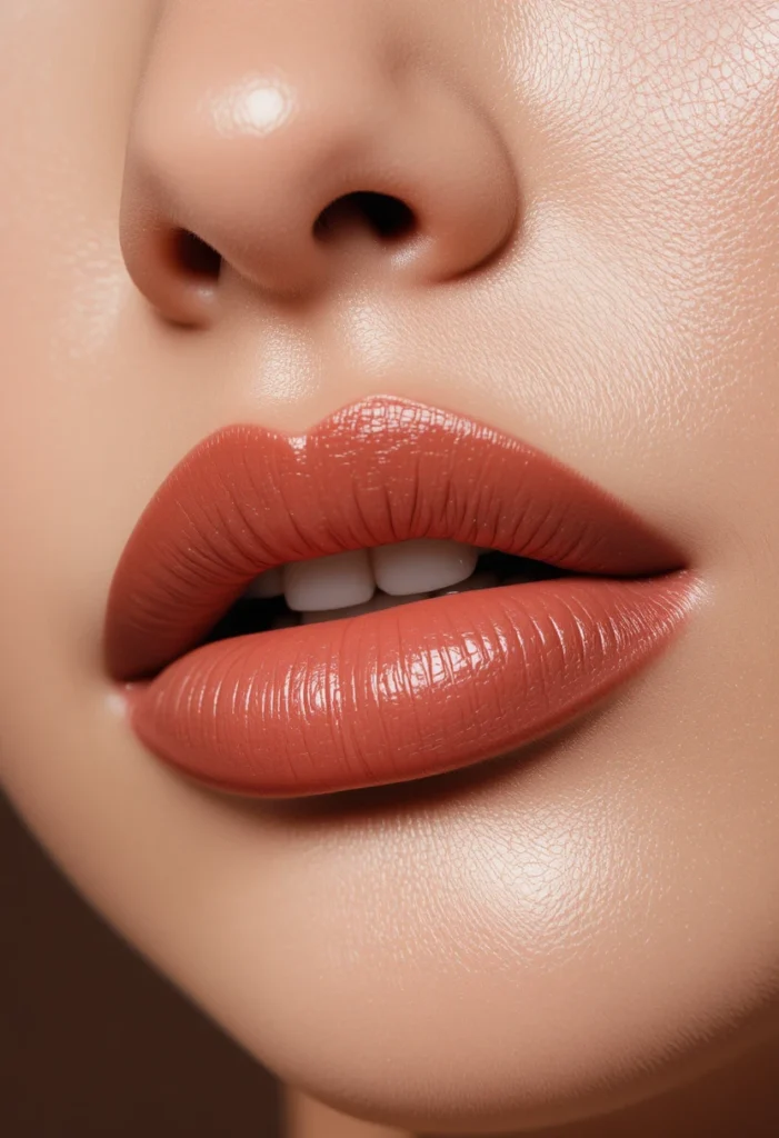
For lip definition that looks natural, shadow placement is more effective than dark liner. On your face chart, draw a thin, soft line just underneath your bottom lip, following the curve where the lip meets the skin. This area naturally catches shadow in real life, so enhancing it slightly with a cool‑toned bronzer or contour powder makes lips appear fuller and more lifted. Do not draw this line on the lip itself—it goes on the skin beneath the lip, fading as it reaches the corners of the mouth.
Your face chart clarifies why this trick works better than over lining. Over lining the actual lip often looks obvious and can smudge, while shadow placement stays subtle. Sketching this zone on paper teaches you to keep the line very short and diffuse—no more than half an inch in the center of the lower lip area. When you later apply it on your face, you’ll use a small, fluffy brush and tap off excess product. The result is a softly projected pout that looks like it came from good bone structure, not makeup tricks.
19. Map Underpainting Placement Before Foundation for a Natural Flush

Underpainting means applying cream contour, blush, and highlighter before your foundation, then covering it with a light layer of base product. On your face chart, use a different color or dashed line to mark these underpainting zones. They should be more exaggerated than your normal placement because the foundation will soften and diffuse them. For example, draw your underpainting blush in a larger circle, knowing that foundation will reduce its intensity by about half. This technique creates a glow that comes from within rather than sitting on top of the skin.
Seeing underpainting on a face chart removes the fear of overdoing it. You’ll realize that the chart’s exaggerated zones are intentional—the foundation acts as a filter. Your chart also helps you remember which products go where because once foundation is on, the original marks disappear. By keeping a photo of your underpainting chart, you can replicate the placement every time. This method is especially useful for textured or dry skin, as it requires less powder and buffing, keeping your skin looking like skin while still having dimension.
20. Position Color Corrector Only on Discolored Zones, Not Entire Areas
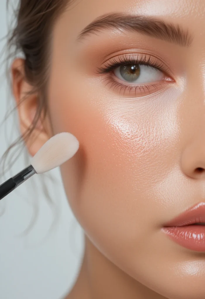
Color correctors (green for redness, peach for dark circles, lavender for sallowness) fail when people smear them across entire sections of the face. On your face chart, mark small, specific dots only where the discoloration actually exists. For example, green corrector might be a tiny dot on a red pimple or a thin line around the nose—never across the whole cheek. Peach corrector goes only in the darkest part of the undereye trough, not the entire undereye area. These precise placements prevent your foundation from looking gray or muddy.
Your face chart will show you how little corrector you actually need by isolating the problem zones. When you draw a large swath of color on the chart, you immediately see how unnatural it looks. Keeping corrector placement tiny and targeted means you can use a minuscule amount of product, then layer foundation or concealer only over those spots. This approach saves product, prevents caking, and lets your natural skin tone show through everywhere else. After a few charting sessions, you’ll develop an instinct for where to dab corrector without thinking.
21. Map Final Blending Zones to Connect All Placements
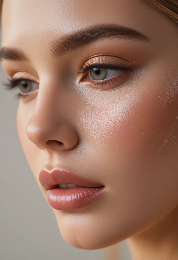
The last placement on any face chart isn’t a product—it’s the blending zones where different products meet. Draw soft, overlapping circles where your bronzer meets blush, where contour meets highlighter, and where eyeshadow crease meets brow bone. These zones should be about the size of a fingertip. Recognizing on paper that every sharp line needs a blending zone prevents the “patchwork” look. When you apply makeup, you’ll actively work those areas with a clean brush or sponge, softening edges so that every placement flows into the next like a gradient.
Your completed face chart with blending zones becomes a master reference. You’ll see that the distance between contour and blush should be about a finger’s width of blended skin, not a harsh line. The chart also reveals where blending is unnecessary—for example, the inner corner highlight should stay crisp, not blended into your nose. By finishing your chart with these transition areas, you internalize the most professional secret of all: placement is only half the work; seamless blending is the other half.
Conclusion
With these twenty‑one face chart tips, you now have a complete visual toolkit to map any makeup look with confidence and precision. A well‑used face chart removes the guesswork, saves you from product mistakes, and trains your eye to see your own unique bone structure as the true guide. Whether you are a beginner learning the basics or an enthusiast refining your technique, drawing your placements before you pick up a brush will transform your routine into an intentional, artistic process. Keep your favorite charts, adjust them as your style evolves, and enjoy the freedom of makeup that finally works with your face—not against it.