Let me start with a quick story. A few years ago, my cousin Sarah decided to renovate her tiny, windowless guest bathroom. She was tired of the dull, beige walls that made the space feel like a doctor’s waiting room. She picked a color she loved—a deep, moody navy—without thinking about the bathroom’s lack of natural light. The result? A cave-like dungeon that made her feel claustrophobic every time she washed her hands. She learned the hard way that bathroom paint colors aren’t just about personal preference; they’re about understanding how light, moisture, and space work together.
That’s why I’ve put together this guide. Over the next few minutes (and roughly 5,000 words), we’ll explore 18 stunning bathroom paint colors, from calming neutrals to bold statements. I’ll share a step-by-step guide, real-life anecdotes, and insider tips to help you buy with confidence. By the end, you’ll know exactly which shade will make your morning routine feel like a spa visit.
Let’s dive in.
Why Choosing the Right Bathroom Paint Color Matters More Than You Think
Before we get to the colors themselves, let’s talk about why this decision is so critical. Bathrooms are unique spaces. They deal with high humidity, splashing water, and often, limited natural light. The wrong color can make a spacious bathroom feel cramped, or a cold bathroom feel even chillier.
On the flip side, the perfect bathroom paint colors can:
- Make a small powder room feel airy and expansive.
- Add warmth to a north-facing bathroom.
- Hide minor imperfections on textured walls.
- Boost your mood first thing in the morning.
Furthermore, paint is one of the most cost-effective upgrades you can make. For the price of a few pizzas, you can completely transform a room. And honestly, if you hate it? You can repaint. No harm done.
So, grab a cup of coffee (or tea), and let’s explore these 18 gorgeous options.
Part 1: Soft & Serene – The Spa-Inspired Colors
These shades are perfect if you want your bathroom to feel like a relaxation retreat. They work well in both master baths and guest bathrooms.
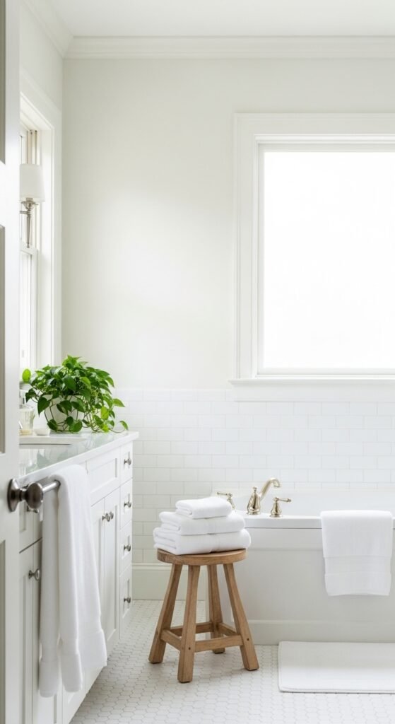
1. Classic White

Let’s start with the obvious choice, but don’t roll your eyes just yet. Classic White isn’t boring—it’s a blank canvas. I remember helping my neighbor paint his cluttered, old-fashioned bathroom white. Suddenly, the room felt twice as large. His vintage mirror popped, and even his towels looked brighter.
Why it works: White reflects light, making small bathrooms feel huge. It’s also timeless. You’ll never tire of it.
Best for: Tiny powder rooms, bathrooms with unusual tile, or any space where you want other elements (like a colorful vanity) to shine.
Pro tip: Use an eggshell or satin finish to resist moisture. Flat white will show every water spot.
Also Read:Lucky Charm Rice Crispy Treats: The Magical Dessert That Brings Smiles (and Good Fortune)
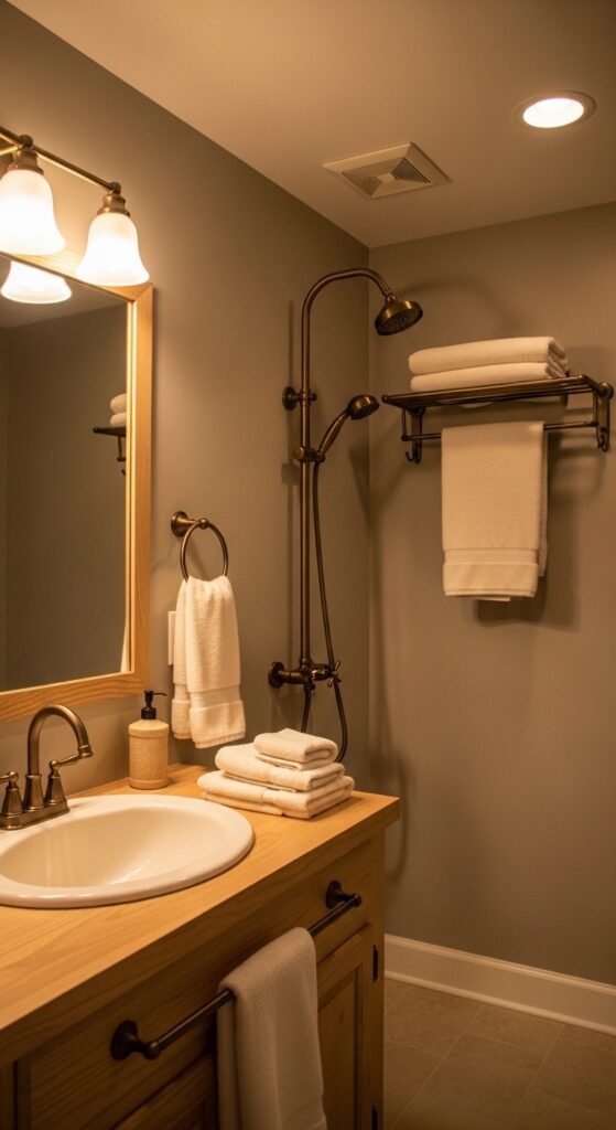
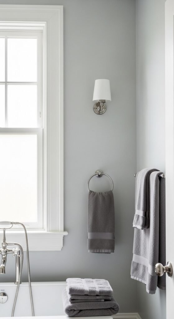
2. Soft Gray (Silver Satin)

Gray has been the darling of interior design for a decade, and for good reason. Soft Gray adds sophistication without being cold. My friend Mark used a pale gray called “Silver Satin” in his master bath, paired with white marble countertops. The result was so elegant that his wife started taking baths just to admire the walls.
Why it works: Gray neutralizes the yellow undertones that beige can have. It’s a perfect backdrop for chrome fixtures and glass shower doors.
Best for: Modern or transitional bathrooms.
Step-by-step tip: Test gray samples on all four walls. Gray can look blue, green, or purple depending on the light. Observe the samples at morning, noon, and night.
3. Pale Blue (Morning Mist)
There’s a reason why so many spas use Pale Blue. It’s scientifically calming. Anecdote time: My aunt suffers from anxiety, and she painted her bathroom “Morning Mist.” She told me that just stepping into that room lowers her heart rate. It’s like visual deep breathing.
Why it works: Blue evokes water and sky, which feels natural in a bathroom. It also complements white fixtures beautifully.
Best for: Bathrooms with natural light. In dark bathrooms, pale blue can look dingy.
Pair with: Warm wood accents and fluffy white towels.
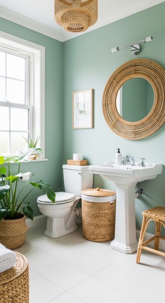
4. Seafoam Green
Seafoam Green is the love child of blue and green. It’s cheerful without being loud. I once stayed at an Airbnb with a seafoam green bathroom, and I swear I took longer showers just because the color made me happy. It’s fresh, clean, and a little bit retro.
Why it works: Green is restful for the eyes. Seafoam specifically has enough gray in it to keep it sophisticated.
Best for: Family bathrooms or beach houses.
Pro tip: Avoid glossy finishes. A matte or eggshell seafoam green feels more organic.
5. Warm Greige (Gray + Beige)
Can’t decide between gray and beige? Warm Greige is your answer. This color is incredibly forgiving. My brother painted his high-traffic kids’ bathroom in greige, and it hides toothpaste splatters and handprints like a champ. Plus, it works with any color scheme—from bright yellow towels to deep plum accents.
Why it works: Greige has the neutrality of gray but the warmth of beige. It’s the ultimate team player.
Best for: Any bathroom, but especially those with warm-toned tiles or wood vanities.
Buying confidence: Look for names like “Accessible Beige” or “Edgecomb Gray” from major brands. These are bestsellers for a reason.
Part 2: Light & Airy – The Space-Expanders

These colors are perfect for bathrooms without windows or with tiny footprints. They trick the eye into seeing more space.
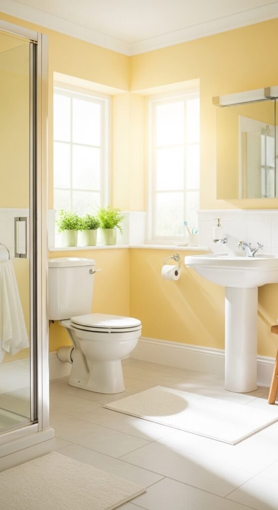
6. Buttercream Yellow
Buttercream Yellow is like sunshine in a can. My coworker Jenna had a dark, narrow hallway bathroom that felt like a cave. She painted it a soft, buttery yellow, and now it’s the happiest room in her house. Her kids fight over who gets to use it first.
Why it works: Yellow reflects light exceptionally well. It also adds warmth to cool, north-facing bathrooms.
Best for: Windowless bathrooms or powder rooms.
Warning: Avoid neon or bright yellow. Stick to pale, creamy tones. Think “lemon meringue,” not “highlighter.”
7. Icy Mint
Icy Mint is a pale blue-green with a cool, refreshing vibe. It’s lighter than seafoam and has more white in it. I painted my own guest bathroom this color two years ago, and every visitor compliments it. One friend said it felt like brushing her teeth inside a glacier—in a good way.
Why it works: The cool tone makes steamy bathrooms feel less oppressive. It also pairs beautifully with copper or brass fixtures.
Step-by-step guide to testing icy mint:
- Buy a sample pot (most brands offer 8-ounce sizes).
- Paint a 2×2 foot square on each wall.
- Live with it for 3 days. Look at it in artificial light and daylight.
- If it looks too blue, add a drop of green. If too green, add white.
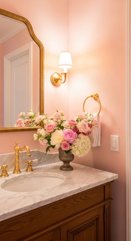
8. Blush Pink (Powder Room Perfection)
Don’t run away! Blush Pink is not your grandmother’s bubblegum pink. It’s a muted, dusty rose that feels modern and chic. I was skeptical until I saw it in a designer showroom. The walls were blush, the trim was white, and the fixtures were black. It was stunning. Edgy, yet soft.
Why it works: Blush pink flatters all skin tones (important for a bathroom with a mirror). It also adds warmth without being overwhelming.
Best for: Powder rooms or romantic master baths.
Pair with: Matte black hardware and greenery (fake or real).
9. Pearl Gray

Pearl Gray has a subtle silver shimmer in it. It’s not glittery—more like a luminous sheen. My hairstylist painted her salon bathroom this color, and it makes the space feel expensive. Even her cheap plastic accessories look high-end against it.
Why it works: The pearl finish (not the paint finish, but the color) reflects light softly, reducing shadows under your eyes when you look in the mirror.
Best for: Vanity areas or bathrooms with dim lighting.
Pro tip: Use a semi-gloss paint finish to enhance the pearl effect. But only if your walls are perfectly smooth.
Part 3: Bold & Beautiful – Make a Statement

Ready to be brave? These bathroom paint colors are for people who want their bathroom to be memorable. Just remember: bold doesn’t mean crazy. It means intentional.
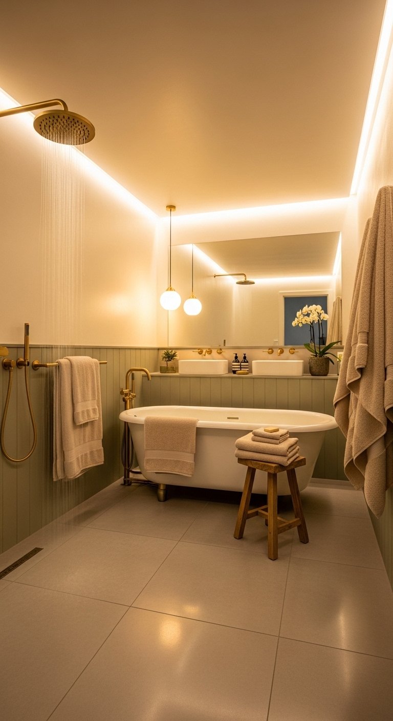
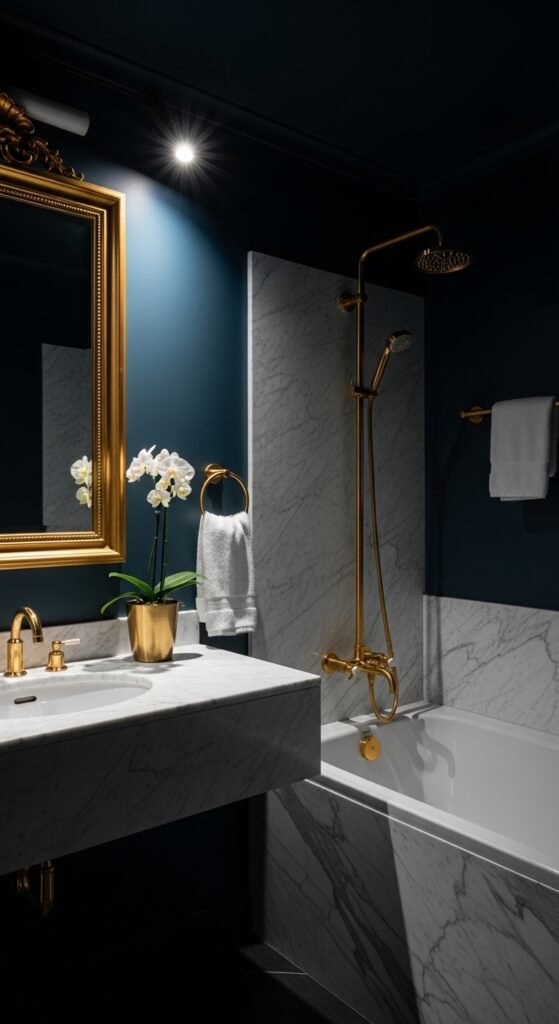
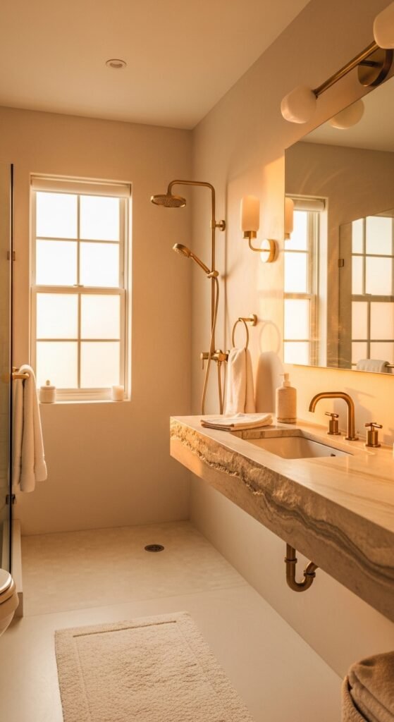
10. Deep Navy (Midnight Sail)

Remember my cousin Sarah’s navy disaster earlier? Well, she tried again—this time with a Deep Navy in a large master bathroom with a skylight. And it worked beautifully. The key is light. Navy needs either natural light or excellent artificial lighting.
Why it works: Navy is dramatic and cozy. It makes white fixtures pop like crazy. It also hides mildew stains (gross but true).
Best for: Large bathrooms with white tile, bright lighting, and high ceilings.
Step-by-step guide to using deep navy:
- Paint only one accent wall first. Live with it for a week.
- If you love it, paint the whole room. If it feels too dark, keep it as an accent.
- Use a matte finish for navy—glossy navy looks like a pool table.
11. Charcoal Black

Yes, black. Charcoal Black is actually a very dark gray, not pitch black. It’s moody, modern, and masculine. A friend of mine, a bachelor, painted his small half-bath in charcoal. He added a gold mirror and a single orchid. The result was pure James Bond. Women who visited asked him for design advice.
Why it works: Dark colors recede visually, which can make a small room feel larger (counterintuitive, I know). Plus, charcoal hides soap scum and water spots.
Best for: Half-baths, powder rooms, or any bathroom you want to feel like a speakeasy.
Pro tip: Use white or gold accessories for contrast. And install bright, warm lighting (2700K to 3000K).
12. Terracotta (Burnt Clay)
Terracotta is having a massive comeback. This earthy, reddish-brown color feels warm and organic. I visited a friend’s 1920s bungalow, and her terracotta bathroom made me feel like I was in a Santa Fe art studio. She paired it with a concrete sink and woven baskets. Gorgeous.
Why it works: Terracotta complements plants, wood, and natural fibers. It’s also very forgiving of splashes.
Best for: Eclectic, bohemian, or Southwestern-style bathrooms.
Caution: In a very small, dark bathroom, terracotta can feel like a cave. Use it only if you have decent light.
13. Forest Green (Hunter’s Cloak)
Forest Green is deep, rich, and a little unexpected. My old college roommate painted her bathroom this color, and it felt like stepping into an enchanted forest. She had brass fixtures and a clawfoot tub. Every time I visited, I wanted to take a bath just to soak in the ambiance.
Why it works: Green is the most restful color for the human eye. Deep green adds drama while still feeling natural.
Best for: Vintage or traditional bathrooms.
Buying confidence: Look for paints labeled “bathroom” or “kitchen & bath” that have mildew-resistant additives. Forest green is a high-moisture area hero if you get the right formula.
Part 4: Warm & Cozy – Inviting Neutrals
Not everyone wants a spa or a statement. Some of us want a bathroom that feels like a warm hug. These colors are for you.
14. Creamy Beige (Vanilla Bean)
Creamy Beige is not the beige of the 1990s (no pink undertones, thank you). This is a warm, rich cream that feels like fresh butter. My parents renovated their bathroom last year and chose this color. Now, every morning feels like a cozy farmhouse morning, even in the middle of winter.
Why it works: Beige adds warmth to cool, gray light. It also makes wood tones and natural stone look richer.
Best for: Traditional bathrooms, log cabins, or any space with warm lighting.
Pro tip: Avoid beige with yellow undertones if you have fluorescent lights. It will look like old nicotine.
15. Mushroom Taupe
Mushroom Taupe is a gray-brown with a hint of purple. Sounds weird, I know. But trust me. It’s the color of the inside of a mushroom cap. It’s grounding and sophisticated. I helped a friend paint her rental bathroom this color, and the landlord was so impressed he offered to pay for the paint.
Why it works: Taupe is a chameleon. It looks gray in some light, brown in others. It goes with everything: chrome, brass, black, white, even wood.
Best for: Any bathroom, but especially those with beige or cream tiles.
Step-by-step to choosing taupe:
- Get three taupe samples: one cool, one warm, one neutral.
- Paint them next to your tile or flooring.
- The right taupe will make your tile look intentional, not dated.
16. Warm Almond (Sand Dune)
Warm Almond is like creamy beige’s lighter cousin. It has a touch of yellow that keeps it sunny. My yoga instructor painted her bathroom this color, and she said it reminds her of the desert at dawn. Peaceful, quiet, and grounding.
Why it works: It’s light enough to expand a small space but warm enough to avoid the “hospital” feel.
Best for: Small bathrooms with little natural light. It works magic there.
Pair with: Teal or navy towels for a pop of contrast.
Part 5: Unexpected Gems – The Wildcards
Finally, let’s look at colors you might not have considered. These are for the adventurous souls.
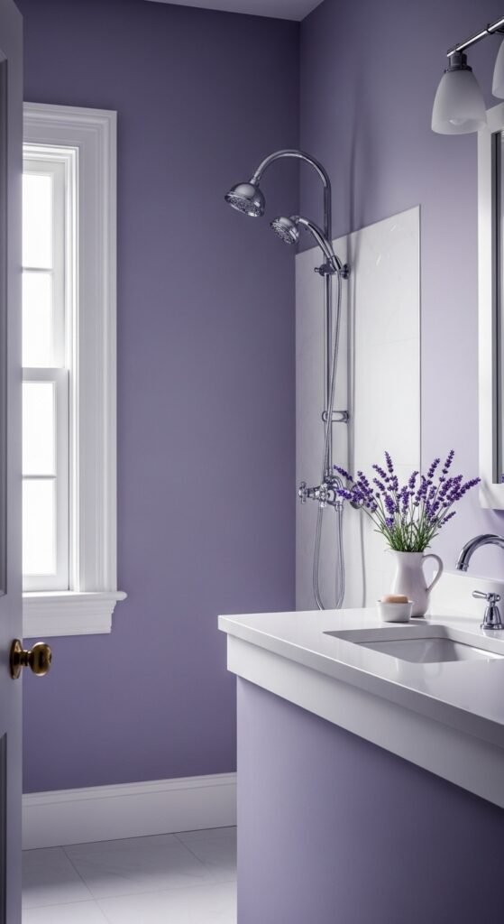
17. Lavender Gray (Wisteria Whisper)
Lavender Gray is mostly gray with a hint of purple. It’s soft, dreamy, and incredibly calming. I discovered this color when a friend painted her meditation room (attached to her bathroom) with it. She said it helps her transition from chaos to peace.
Why it works: Purple is associated with creativity and calm. The gray keeps it from feeling childish.
Best for: Master bathrooms or any space where you unwind.
Pro tip: Use a satin finish to add a subtle sheen. It enhances the lavender undertone.
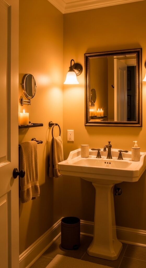
18. Butterscotch (Amber Glow)
Let’s end with a bang. Butterscotch is a warm, golden amber color. It’s bold, but not in a dark navy way—it’s bold in a “glass of whiskey by the fire” way. I saw this in a designer’s personal bathroom once. She had white subway tile, a vintage mirror, and butterscotch walls. It was so warm and inviting that I took a photo for inspiration.
Why it works: Gold tones reflect light beautifully and add incredible warmth. They also make white and black fixtures look like art.
Best for: Bathrooms with lots of white (white tub, toilet, sink). It needs that contrast.
Warning: Do not use butterscotch in a room with yellowed or old white fixtures. It will emphasize the yellow.
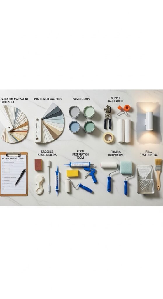
Step-by-Step Guide to Buying and Painting with Confidence
Now that you’ve seen the 18 stunning bathroom paint colors, let’s make sure you buy the right product and apply it correctly. Follow these steps to avoid my cousin Sarah’s navy disaster.
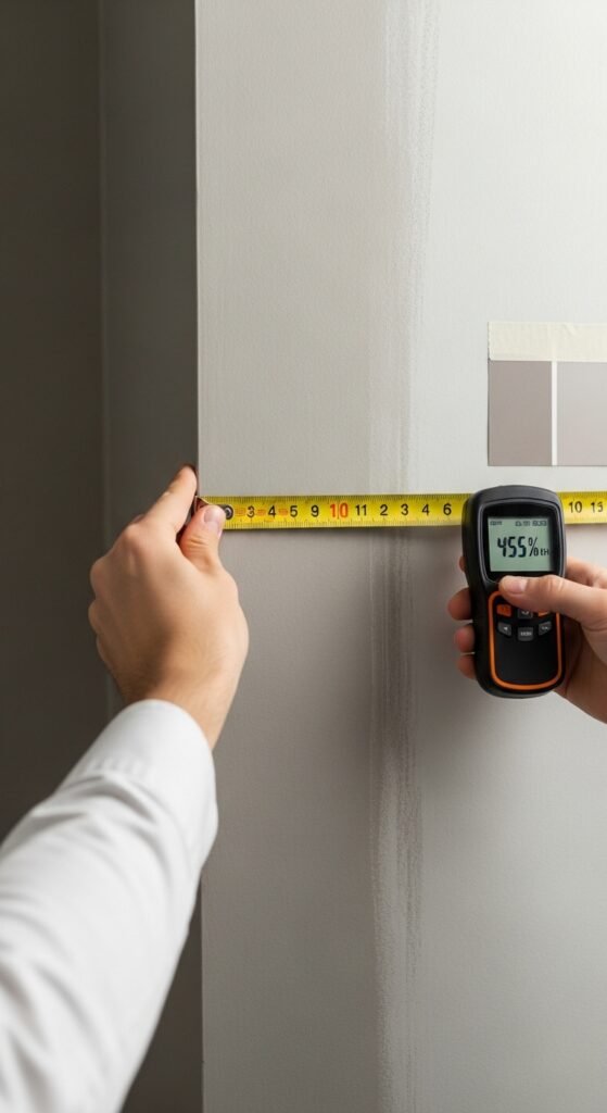
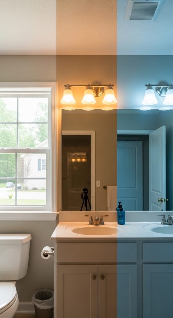
Step 1: Assess Your Bathroom’s Conditions
Before you buy a single sample, answer these questions:
- How much natural light? (Large window? Small window? None?)
- What direction does the window face? (North = cool light. South = warm light.)
- What color are your tiles, vanity, and countertops?
- Do you have a fan to control humidity?
Write down your answers. They will guide every decision.
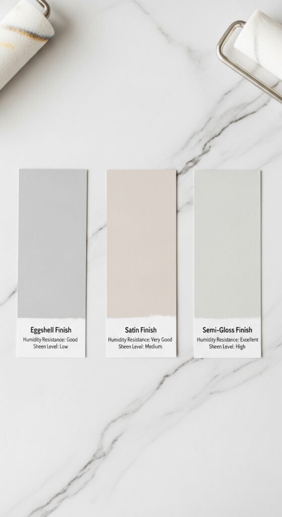
Step 2: Choose the Right Paint Finish (This Is Critical)
For bathrooms, never use flat or matte paint on walls that get wet. Instead, choose:
- Eggshell: Minimal shine, good for low-moisture areas like the upper walls.
- Satin: Soft shine, easy to clean. Best for most bathroom walls.
- Semi-gloss: Very shiny, very washable. Use on trim, ceilings, or walls that get direct splashes (like behind the sink).
Pro tip: Look for paints labeled “bathroom paint” or “kitchen & bath.” These have mildewcides and better adhesion.
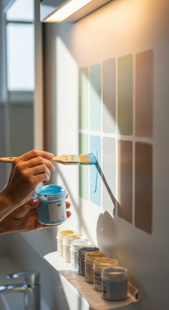
Step 3: Buy Sample Sizes First (Never Skip This)
I can’t stress this enough. A color that looks perfect online can look awful on your wall. Buy 8-ounce sample pots of your top 3 colors.
How to test:
- Paint a 2×2 foot square on each wall (not just one wall).
- Observe at 9 AM, 12 PM, 5 PM, and 9 PM.
- Take photos. Compare.
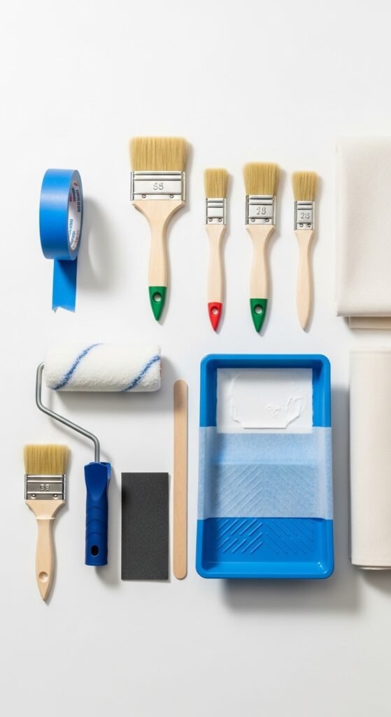
Step 4: Gather Your Supplies
To paint like a pro, you’ll need:
- Mildew-resistant primer (essential for bathrooms)
- High-quality angled brush (for edges)
- 9-inch roller with 3/8-inch nap (for smooth walls)
- Paint tray and liners
- Painter’s tape (FrogTape is my favorite)
- Drop cloths
- Sanding sponge (120-grit)
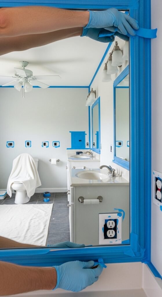
Step 5: Prepare the Room
- Remove all towels, rugs, and accessories.
- Clean walls with a TSP solution (trisodium phosphate) to remove soap scum.
- Patch holes with spackle. Sand smooth.
- Tape off trim, ceiling, and fixtures.
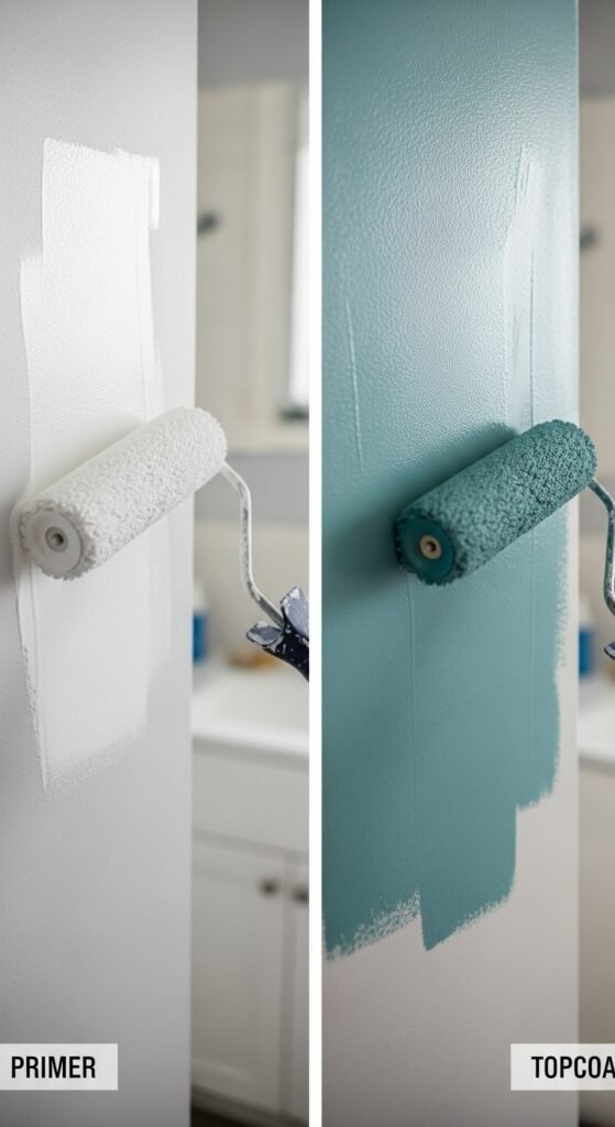
Step 6: Prime, Then Paint
Do not skip primer in a bathroom. Primer blocks stains, prevents mildew, and helps the topcoat adhere.
- Apply one coat of mildew-resistant primer. Let dry 4 hours.
- Apply first coat of your chosen bathroom paint color. Let dry 4 hours.
- Apply second coat. Let dry overnight before removing tape.
Step 7: The Final Test
After the paint is fully dry (24 hours), take a hot shower. Let the room steam up. Check for:
- Bubbling or peeling (means you needed better primer)
- Water beading (good sign)
- Any mildew spots after 1 week (means your paint lacks mildewcide)
Why You Should Buy Premium Bathroom Paint (And Not Cheap Out)
Look, I get it. Paint is expensive. A gallon of premium bathroom paint can cost $50-$80, while budget paint is $20-$30. But here’s the truth from someone who has painted 12 bathrooms (including my own):
Cheap paint will cost you more in the long run.
Here’s why:
- Cheap paint requires 3-4 coats. Premium covers in 2 coats. You save time and money.
- Cheap paint lacks mildewcides. Within 6 months, you’ll see black spots in the corners. Then you have to scrub with bleach (damaging the paint) or repaint entirely.
- Cheap paint fades and scuffs easily. In a bathroom where you’re touching walls with wet hands, that’s a disaster.
Premium paints from brands like Benjamin Moore (Aura Bath & Spa), Sherwin-Williams (Duration Home), or Behr (Marquee) are specifically formulated for high-humidity areas. They resist moisture, prevent mold, and stay vibrant for years.
My recommendation: Spend the extra $30. It’s the difference between repainting every 2 years vs. every 8-10 years. Do the math. Premium saves you money.
Real-Life Anecdote: How One Color Changed a Morning Routine
Let me wrap up the color section with a story that always makes me smile. My friend David is a grumpy morning person. He hates waking up. His bathroom was a depressing shade of builder-grade beige. One weekend, his wife surprised him by painting it Soft Gray (Silver Satin) with crisp white trim. She also added a small plant and a bamboo mat.
The next Monday morning, David walked into that bathroom and literally stopped. He told me, “I felt calmer. The gray was so peaceful, and the white made it feel clean. I didn’t rush my shower. I actually enjoyed my morning.”
That’s the power of the right bathroom paint colors. It’s not just decoration. It’s a daily mood booster.
Frequently Asked Questions (To Boost Your Confidence)
Q: Can I use regular wall paint in a bathroom?
A: You can, but you shouldn’t. Regular paint will peel, bubble, or grow mildew. Always choose bathroom-specific paint with a satin or semi-gloss finish.
Q: What’s the best color for a small bathroom with no windows?
A: Buttercream Yellow or Warm Almond. These light, warm colors reflect artificial light beautifully and prevent the “dungeon” feel.
Q: How do I prevent mildew on painted bathroom walls?
A: Three things: (1) Use mildew-resistant primer. (2) Use bathroom paint with mildewcides. (3) Run your exhaust fan during and 30 minutes after every shower.
Q: Can I paint over glossy tile or wallpaper?
A: Yes, but you must sand the gloss off (or use a deglosser) and prime first. Otherwise, the paint will peel in sheets.
Q: What’s the most popular bathroom paint color right now?
A: Soft Gray and Seafoam Green are trending. But Blush Pink is rising fast for powder rooms.
Final Thoughts: Buy With Confidence, Paint With Joy
Choosing from 18 bathroom paint colors might feel overwhelming. But here’s the secret: there is no single “perfect” color. There’s only the color that feels right to you in your space.
Start with the step-by-step guide. Buy sample pots. Live with them for a few days. Then, invest in premium, mildew-resistant paint. Follow the preparation steps carefully.
And remember my cousin Sarah? She eventually repainted her navy disaster to Seafoam Green, and now she loves her bathroom. She learned that mistakes are just samples you didn’t mean to buy.
So go ahead. Pick a color that makes you smile. Buy the good stuff. And transform your bathroom into a space you’ll actually enjoy spending time in.
You’ve got this.